The Art of Calligraphy: Preserving a Vanishing Aesthetic

When looking at calligraphy, one cannot help but feel a sense of admiration and wonder. Every stroke of perfection and every line of grandeur comes from meticulous, highly skilled effort. The beauty of this type of penmanship comes from the way that each alphabet is created, which is accurately sized and proportioned with no room for error.
Did you know that calligraphers were sought by kings in the past? Similar to painting and sculpture, this ornamental form of handwriting has a distinguished place in the world of fine arts.
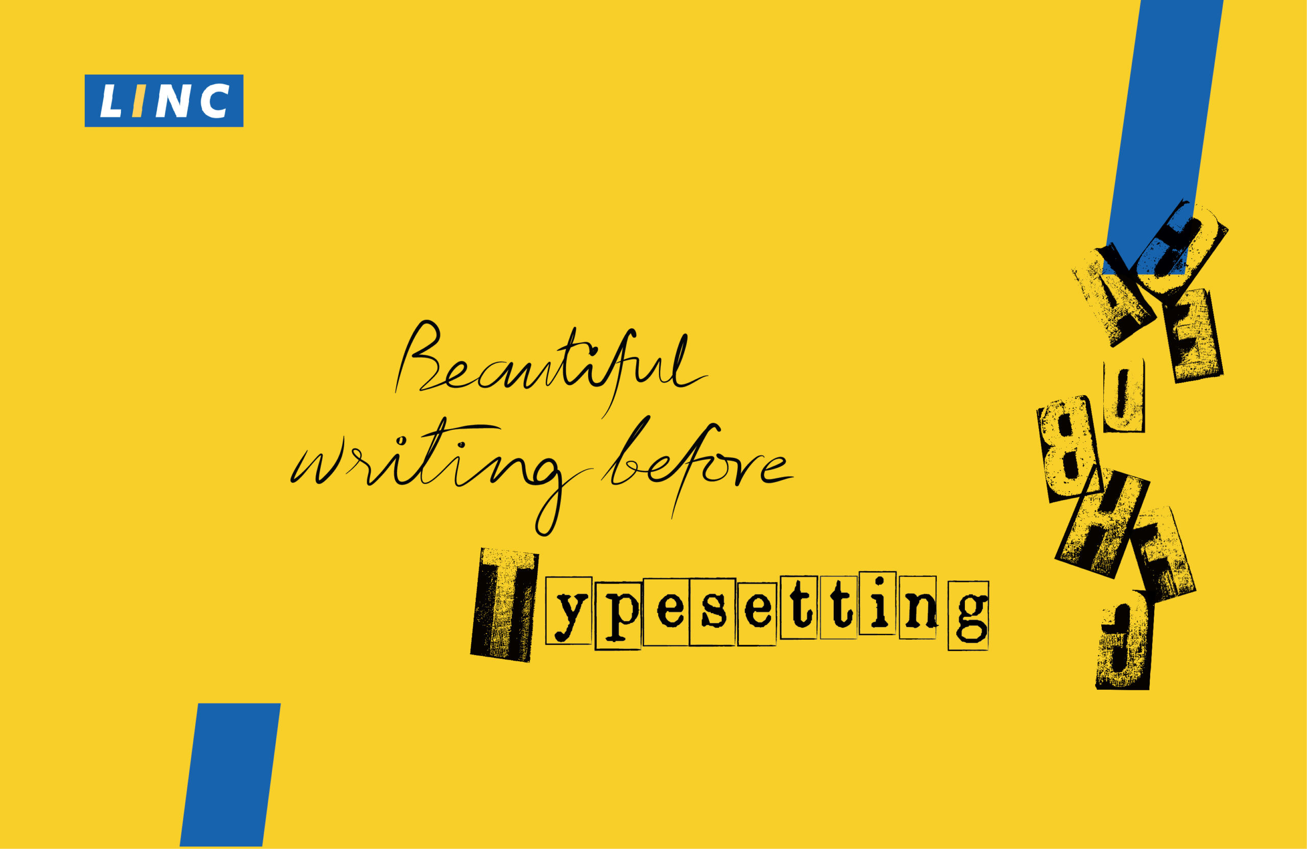
However, times have drastically changed. With the click of a button, one can now print hundreds of copies with texts in a variety of fonts and formats. Even as we applaud technological advancements, it will never succeed in replacing the creative flair of the written word in ink.
Penmanship as an art is truly something worth learning and preserving.
Let’s take a closer look into what this style of writing is all about.
The Ink-credible Works of Calligraphy: The Rules that Govern it
Being around for centuries, the term has its origin from the combination of the Greek words ‘kalli’ (beautiful) and ‘graphia’ (to write). There is concrete evidence which points to the exact origin of this type of penmanship. However, the word itself came into existence around the mid-15th century.
As far as the traditional concept goes, calligraphic scripts adhere to precise, structured and individual strokes that create different alphabets and letters. It uses specific tools and employs specific height, measurement and angles. In other words, the requirements have to be fully met for it to be indicative of a specific style of calligraphy. A classic example of this are fonts such as Copperplate and Spencerian.
With time, there came an emerging style called ‘modern calligraphy’ that is known to deviate from the structural rules of the traditional styles. Being fluid in nature, it’s not an exact science which allows artists to freely create their own unique forms. Of course, you cannot just scribble random letters on a paper and call it modern calligraphy. There are a few basic ground rules that need to be kept in mind.
Strokes: Upward strokes should be thin while the ones going down should be thick.
Grip: Hold your pen/brush at a 45-degree angle for optimal line drawing.
Spacing: Keep your handwriting legible by carefully spacing words and letters.
Sizes: A consistent size should be maintained for maintaining visual harmony.
A Modern Outlook on a Traditional Art Form
It’s not wrong to point out that computers and desktop printing are heralding the demise of this age-old art. This is largely due to the use of improved technology and its use in all professions of daily life. People want quicker results with a variety of fonts at their disposal. But to compare printed words with those crafted with professional passion and masterful visual expression is hardly justified.
The fading hand workmanship is beautiful in its own right.
In fact, we’re lucky to witness such an aesthetic before it becomes just another page in the history books. The question is, does it really have to end?
Most think that the art of calligraphy is an age-old process that is bound to fade with time. However, that is not entirely true. This fancy style of writing has transformed and actually integrated itself with digitalization.
With platforms such as YouTube and Instagram, it is now easier than ever to witness and learn the art as well. Digital calligraphy is also on the rise with devices such as the iPad Pro and Apple Pencil offering pressure sensitivity features.
With countless tools and options, it’s now up to us to keep the existence of this art form alive!


